
Brightspace is an excellent tool to provide equitable, inclusive access to course content, documents, and media.
As you create content, take advantage of Brightspace’s built-in tools and the Accessibility Checker to ensure what you share is accessible. Accessible content is inclusive, democratic, and maximizes learner independence.
In the second of this five-part series, we will learn about accessible colour.
Colour
Ensure you choose accessible colours. Text colour needs to have a contrast ratio of at least 4.5:1 against the background. Additionally, colour should not be used alone to emphasize content or convey meaning.
Accessible colour aids all learners. Primarily, accessible colour is required for people with color blindness. However, smart colour choices benefit all learners in numerous ways:
- Includes all, regardless of access means.
- Provides similar appearance regardless of device and user settings.
- Retains all information if printed in black and white.
- Reduces eye fatigue, glare from the sun, and allows use of dark/night mode or custom contrast settings.
- Makes content easier to read for everyone.
To change font colours in Brightspace
- Open the Select Colour tool in the Editor toolbar.
- Choose a colour and use the built-in contrast checker to ensure accessible colour choices./li>
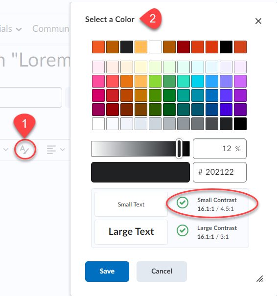
A ratio of at least 4.5:1 is required. Remember that regardless of colours used, ensure that colour is not the only method used to highlight or differentiate content.
Learn more about accessible colour in the Langara Accessibility Handbook
Accessibility Checker
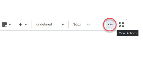
Brightspace includes a built-in accessibility checker. The checker appears on the second row of the editor toolbar.
- Select More Actions to reveal the second row of the toolbar
- Select Accessibility Checker
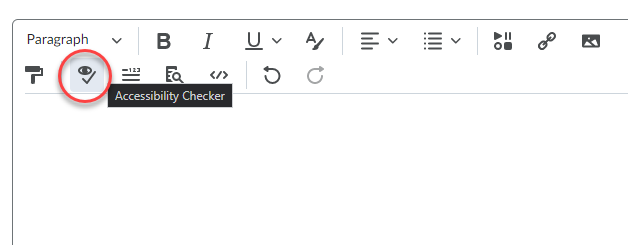
The accessibility checker will note colour contrast issues and offer solutions to improve the contrast of your content. The Accessibility Checker cannot determine if colour is used to convey meaning.
Watch for more posts in the Brightspace Accessibility in Five series coming soon, including:
- Link Text
- Colour
- Headings
- Tables
- Text Equivalents
- Bonus: Accessible Uploads
