Brightspace Accessibility in Five, Bonus: Accessible Uploads

Brightspace plus accessibility logoBrightspace is an excellent tool to provide equitable, inclusive access to course content, documents, and media. 

As you create content, take advantage of Brightspace’s built-in tools and the Accessibility Checker to ensure what you share is accessible. Accessible content is inclusive, democratic, and maximizes learner independence. 

However, Brightspace is also a good tool to distribute other material such as lecture slides and documents. It is important that that material also be accessible. 

Creating accessible Word and PowerPoint documents is straightforward. Ensuring a PDF is accessible requires additional time and understanding of unique tools and code. 

The best practices (link text, colour contrast, headings, tables, and text equivalents) listed in this series apply to documents of all types. The process to ensure accessibility is slightly different depending on software.  

Microsoft Office Files

Word and PowerPoint have a built-in accessibility checker. To use this tool: 

  1. Navigate to Review 
  2. Select Check Accessibility 

Read more about making Office documents accessible.

PDF

To make accessible PDFs, it is best practice to make a Word or PowerPoint presentation accessible and then export to PDF. Adobe Acrobat Pro is required to ensure your PDFs are accessible. Try to avoid PDFs for content, except for forms and content to specifically be printed directly. For more information on making PDFs accessible, consult Langara’s Accessibility Handbook for Teaching and Learning. 

docReader

Brightspace now features the docReader tool. When a Word, PowerPoint, or PDF file is uploaded a Brightspace course, students will be able to have them read aloud using the Open with docReader button below the document viewer pane.

This tool does not absolve content creators of generating accessible content. This tool will not be able to read inaccessible documents.


Check out the other posts in the Brightspace Accessibility in Five series:

  1. Link Text
  2. Colour
  3. Headings
  4. Tables
  5. Text Equivalents

Brightspace Accessibility in Five, 5: Text Equivalents

Brightspace plus accessibility logo

Brightspace is an excellent tool to provide equitable, inclusive access to course content, documents, and media.

As you create content, take advantage of Brightspace’s built-in tools and the Accessibility Checker to ensure what you share is accessible. Accessible content is inclusive, democratic, and maximizes learner independence.

In the fifth of this five-part series, we will learn about text equivalents (alternative text and closed captions).

Alternative Text

Alternative text explains the content and context of an image to screen reader users. To write effective alternative text, consider how you would describe the graphic to a friend over the phone. Try to include all relevant information using proper grammar in less than 120 characters. Learn more in the Langara Accessibility Handbook alternative text chapter. 

Images may be marked as decorative if they are only included for visual effect or if the information in the image is also present in text adjacent to the graphic. 

When uploading a new image, Brightspace automatically prompts for alternative text. Enter a description in the Alternative Text field or check This image is decorative. Screenshot of Brightspace provide alternative text prompt

To add alternative text to existing images: 

  1. Select an existing image and choose Image options
  2. Check Image is decorative or enter a description in the Alternative description field.

Closed Captions

Captions provide a text equivalent of all audio elements in a video, presented visually in time with the video. Closed captions can be toggled on or off by the viewer. Open captions are ‘burned’ into the video and cannot be turned off.

Traditionally, we think of captions as an accommodation for viewers who cannot hear the audio in a video due to hearing loss. Statistics suggest 4-5% of the general population suffer some form of hearing loss. That number increases to around 20% for people over aged 60. However, 80% of 18 to 25-year-olds regularly use captions when watching video.

Captions are not just an accessibility essential, but also an excellent universal design for learning tool.

All new uploads to Kaltura (either in Brightspace My Media or Mediaspace) will have machine-generated captions automatically ordered. Videos added to OneDrive/SharePoint can have machine-generated captions ordered manually. Machine-generated captions are not accurate enough and must be edited. To learn more about captioning, read the Captions and Transcripts chapter of the Langara Accessibility Handbook.

Accessibility Checker

Brightspace includes a built-in accessibility checker. The checker appears on the second row of the editor toolbar.

  1. Select More Actions to reveal the second row of the toolbar
  2. Select Accessibility Checker

The accessibility checker will highlight many accessibility issues and offer solutions to correct them. However, the checker tool will not check videos for captions. This must be verified manually.


Check out the other posts in the Brightspace Accessibility in Five series:

  1. Link Text
  2. Colour
  3. Headings
  4. Tables
  5. Text Equivalents
  6. Bonus: Accessible Uploads

Brightspace Accessibility in Five, 4: Tables

Brightspace plus accessibility logo

Brightspace is an excellent tool to provide equitable, inclusive access to course content, documents, and media.

As you create content, take advantage of Brightspace’s built-in tools and the Accessibility Checker to ensure what you share is accessible. Accessible content is inclusive, democratic, and maximizes learner independence.

In the fourth of this five-part series, we will learn about tables.

Tables

Tables should only be used to present data, not for layout or formatting. Include a header row and/or column and avoid blank, split, and merged cells.

Use the Table tool to insert and modify tables:

Use Table Properties for advanced settings such as style, padding, and formatting.

To set header rows:

  1. Select a cell in the row to be made a header
  2. Open the Table menu and choose Cell Properties
  3. Change Row type to Header and click Save

Do not add images of tables. If you must, ensure the image has alternative text that accurately conveys the table data.

Accessibility Checker

Brightspace includes a built-in accessibility checker. The checker appears on the second row of the editor toolbar.

  1. Select More Actions to reveal the second row of the toolbar
  2. Select Accessibility Checker

The accessibility checker will highlight many accessibility issues and offer solutions to correct them. For tables, the accessibility checker will flag tables without header rows or columns. The checker will also note tables without a caption and suggest users add a summary to long or complex tables.


Watch for more posts in the Brightspace Accessibility in Five series coming soon, including:

  1. Link Text
  2. Colour
  3. Headings
  4. Tables
  5. Text Equivalents
  6. Bonus: Accessible Uploads

Brightspace Accessibility in Five, 3: Headings

Brightspace plus accessibility logo
Brightspace is an excellent tool to provide equitable, inclusive access to course content, documents, and media.

As you create content, take advantage of Brightspace’s built-in tools and the Accessibility Checker to ensure what you share is accessible. Accessible content is inclusive, democratic, and maximizes learner independence.

In the third of this five-part series, we will learn about headings.

Headings

Headings are an important part of documents and web pages. Headings create organizational flow, build connections between key concepts, and break up large blocks of text to increase readability. Screen reader users rely on headings to navigate the web and longer documents. For anything beyond a few paragraphs, headings are essential for screen reader users.

Use headings in a sequential, nested hierarchy. For example, use a Heading 1 for the title or topic. Use Heading 2 for major divisions of content and ideas. Use Heading 3 for subtopics of the major divisions. Brightspace supports 4 heading levels.

You can have multiple headings of the same level, but do not skip a heading level. A Heading 2 can follow a heading 1 or a heading 2. A heading 3 can follow a heading 2 or heading 3 and so on.

Headings benefit all readers. Headings:

• Include all, regardless of access means.
• Provide context and explains relationships between ideas.
• Emphasizes key concepts.
• Provides ‘bookmarks’ for natural breaks.
• Allows for easy review and location of content.

Creating Headings in Brightspace

Select the Format tool in the top left of the editor toolbar and choose the appropriate heading level.

For more information about headings and document structure, consult the Langara Accessibility Handbook.

Accessibility Checker

Brightspace includes a built-in accessibility checker. The checker appears on the second row of the editor toolbar.

  1. Select More Actions to reveal the second row of the toolbar
  2. Select Accessibility Checker

The accessibility checker will highlight many accessibility issues and offer solutions to correct them. For headings, the Brightspace accessibility checker will flag text that could be a heading due to formatting (bolded larger font on a line by itself for example) but is not properly coded as a heading. The accessibility checker also flags headings that are out of sequential order (for example a heading level 3 with no preceding heading level 2).


Watch for more posts in the Brightspace Accessibility in Five series coming soon, including:

  1. Link Text
  2. Colour
  3. Headings
  4. Tables
  5. Text Equivalents
  6. Bonus: Accessible Uploads

Brightspace Accessibility in Five, 2: Colour

Brightspace plus accessibility logo

Brightspace is an excellent tool to provide equitable, inclusive access to course content, documents, and media.

As you create content, take advantage of Brightspace’s built-in tools and the Accessibility Checker to ensure what you share is accessible. Accessible content is inclusive, democratic, and maximizes learner independence.

In the second of this five-part series, we will learn about accessible colour.

Colour

Ensure you choose accessible colours. Text colour needs to have a contrast ratio of at least 4.5:1 against the background. Additionally, colour should not be used alone to emphasize content or convey meaning.

Accessible colour aids all learners. Primarily, accessible colour is required for people with color blindness. However, smart colour choices benefit all learners in numerous ways:

  • Includes all, regardless of access means.
  • Provides similar appearance regardless of device and user settings.
  • Retains all information if printed in black and white.
  • Reduces eye fatigue, glare from the sun, and allows use of dark/night mode or custom contrast settings.
  • Makes content easier to read for everyone.

To change font colours in Brightspace

  1. Open the Select Colour tool in the Editor toolbar.
  2. Choose a colour and use the built-in contrast checker to ensure accessible colour choices./li>

A ratio of at least 4.5:1 is required. Remember that regardless of colours used, ensure that colour is not the only method used to highlight or differentiate content.

Learn more about accessible colour in the Langara Accessibility Handbook

Accessibility Checker

Brightspace includes a built-in accessibility checker. The checker appears on the second row of the editor toolbar.

  1. Select More Actions to reveal the second row of the toolbar
  2. Select Accessibility Checker

The accessibility checker will note colour contrast issues and offer solutions to improve the contrast of your content. The Accessibility Checker cannot determine if colour is used to convey meaning.


Watch for more posts in the Brightspace Accessibility in Five series coming soon, including:

  1. Link Text
  2. Colour
  3. Headings
  4. Tables
  5. Text Equivalents
  6. Bonus: Accessible Uploads

Brightspace Accessibility in Five, 1: Link Text

Brightspace plus accessibility logo

Brightspace is an exceptionally accessible platform. Using Brightspace for your course content, documents, and media is an excellent way to provide equitable, inclusive access to learning material.

Take advantage of Brightspace’s built-in tools and the Accessibility Checker to ensure what you share is accessible. Accessible content is inclusive, democratic, and maximizes learner independence.

In the first of this five-part series, we will learn about adding link text to your Brightspace content.

Link Text

Link text should provide a clear description of the destination, independent of the surrounding text.

Students that with a visual impairement may use screen reader software that allows them to navigate by links. Descriptive link text helps orient and guide them to resources. A list of “click here”, “click here”, “Read more”, etc. is not going to provide users with any meaningful information. Pasting raw URLs in Brightspace should also be avoided as, for example, heading “https://iweb.langara.ca/edtech/blog” is jarring and not a useful indicator of what that link would lead to.

Additionally, sighted users can easily spot or relocate a link when it has a clear text description. As well, all users benefit from quality link text to understand why they would want to click on the link.

Effective link text should be:

  • Descriptive
    • Describe the destination
  • Concise
    • Try to limit link text to a few words
  • Unique
    • If two links on a page go to the same destination, they should have the same link text, otherwise ensure all link text is unique
  • Visually distinct
    • Links should be visually distinct from surrounding text. In Brightspace, stick with default formatting (blue underlined text) for links.

To Link Text in Brightspace

  1. Highlight the text to be linked and select Add/Edit Link
  2. The highlighted text will appear in the Title field. Paste the URL in the Link field and select Create.

Find more information about link text in the Langara Accessibility Handbook and read more about adding hyperlinks in Brightspace.

Accessibility Checker

Brightspace includes a built-in accessibility checker. The checker appears on the second row of the editor toolbar.

  1. Select More Actions to reveal the second row of the toolbar
  2. Select Accessibility Checker

The accessibility checker will highlight many accessibility issues and offer solutions to correct them.


Watch for more posts in the Brightspace Accessibility in Five series coming soon, including:

  1. Link Text
  2. Colour
  3. Headings
  4. Tables
  5. Text Equivalents
  6. Bonus: Accessible Uploads

Increasing Accessibility of Course Content: Tips for using the Brightspace Accessibility Checker

Increasing accessibility of course content: Tips for using the Brightspace Accessibility Checker

Web Accessibility refers to the inclusive practice of making websites and online content usable by people of all abilities and disabilities. Use the Brightspace Accessibility Checker to identify common accessibility issues on your Brightspace course pages.

How to run the Accessibility Checker

The Check Accessibility button is located on the bottom right of the Brightspace HTML Editor
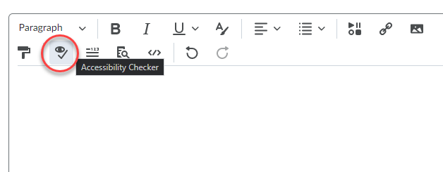
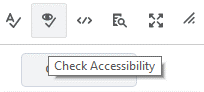
The Accessibility Checker is available within the HTML Editor. When you are in edit HTML mode, the checker is located on the bottom right corner of the Editor, next to the Spellcheck button.

Alternative Text

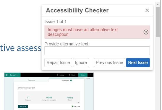
The most common accessibility issue is missing image alternative text (alt text). Alt text is background code added to a digital image that allows a screen reader or other assistive technology to describe the image’s content and meaning to those who cannot see the image or may be unable to process the image due to a cognitive disability. When alt text is missing, the Brightspace Accessibility Checker will flag the issue, noting Images must have an alternative text description.

The Accessibility Checker flags missing alternative text with the message Images must have an alternative text description

How to add alt text

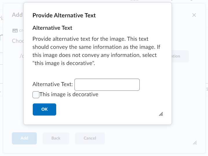
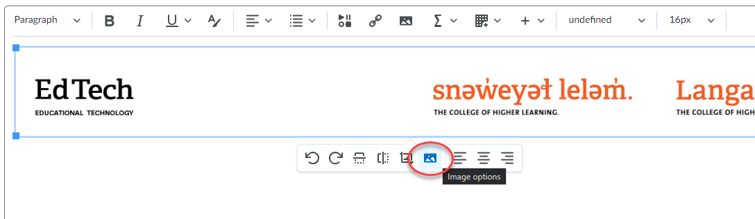
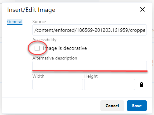
The easiest way to add alt text is to include it when inserting images into a Brightspace page. When you insert an image using the HTML editor, a pop-up appears, prompting you to add alt text. Brightspace add the alt text to the HTML code (e.g., <img src=”filename.jpg” alt=”Example of Microsoft Forms response results.” />).

Treat informative images as decorative by supplying an empty alt attribute or checking the box next to This image is decorative. Brightspace will add alt text of “” to indicate an empty alt attribute.

Brightspace prompts users to add alt text when inserting images

If the Accessibility Checker flags an image as missing alternative text, you can fix the issue by adding alt text inside the report panel or by adding it directly to the HTML code.

Tips for creating alt text

When deciding what to include as alternative text, imagine that you are describing the image aloud over the phone to someone who needs to understand the image.

According to WebAIM, alternative text should:

  • Be accurate and equivalent in presenting the same content and function of the image.
  • Be succinct.
  • Not be redundant or provide the same information as text within the context of the image.
  • Not use the phrases “image of…” or “graphic of…” to describe the image unless the fact that an image is a photograph or illustration, etc. is important content.

WebAIM offers a fantastic guide to creating appropriate alternative text for images.

Note: It is always a good idea to double-check the alt text included in your HTML code. An accessibility checker only indicates whether alt text is included, it cannot check the quality or usability of the alt text.
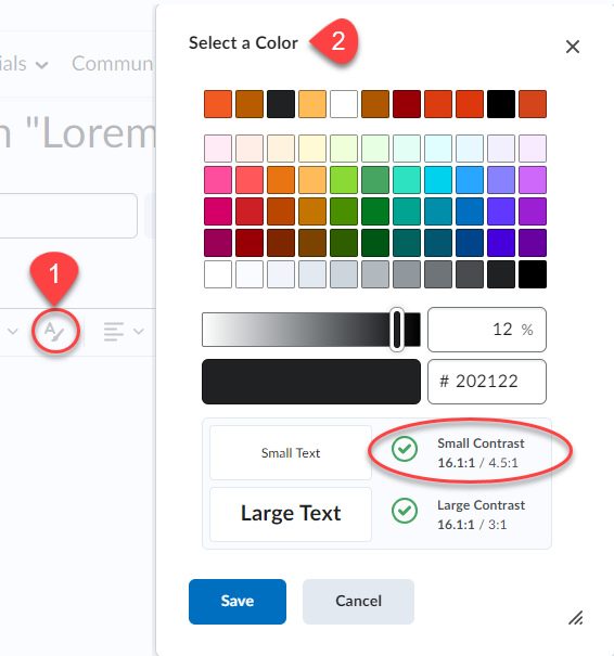
Contrast

Low colour contrast is another common accessibility issue. Insufficient contrast between the foreground and background reduces readers’ ability to perceive content on the page.

Insufficient colour contrast is flagged by the checher

The W3C Web Content Accessibility Guidelines 2.0 define specific contrast ratios that must be met in order to comply at particular levels. To meet the guidelines, text or images of text must have a contrast ratio of at least 4.5:1 (or 3:1 for large text).

The maximum contrast is black vs. white but other options are available such as navy/white, cream/dark brown, yellow/black, and similar color schemes. A colour scheme is considered legible if it can be read in grayscale/black and white mode.

The Accessibility Checker flags:

  • Large text that does not have a contrast ratio of at least 3:1.
  • Visual presentation that does not have a contrast ratio of at least 4.5:1.

Adjusting contrast

Try using the WebAIM Color Contrast Checker to adjust the contrast by lightening or darkening elements.
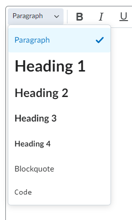
Headings

A heading describes the content that follows it, giving uses a sense of the page’s organization and structure. Headings give sighted users a way to quickly find what they want on the page.

If the underlying code for a page’s headings is correct, screen reader users can also benefit from headings. Screen reader and other assistive technology users can also skip from heading to heading.

The checker flags improperly applied heading styles

How to create headings in Brightspace

Select the text then set it to the proper heading using the Format dropdown menu. Do not skip levels. If the heading levels are not in the correct order, the Accessibility Checker will flag the issue.

Tips for creating headings

    • Headings are ranked <h1> through <h6>.
    • Every page should have an H1 heading, representing the most important idea on the page, and sub-sections organized with <h2> level headings. Those sub-sections can themselves be divided with <h3> level headings, and so on.
  • Headings need to be used in the correct order.
  • Do not skip heading levels to be more specific (for example, do not skip from <h2> to <h5>).
  • Do not select heading levels based on their appearance. Select the appropriate heading rank in your hierarchy.

Note: The Brightspace Accessibility Checker will not flag a page without headings; it only flags incorrectly ordered headings. 
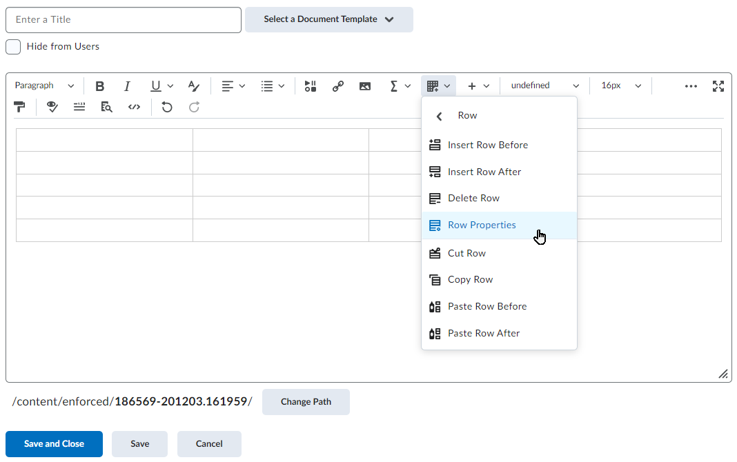
Lists

Lists are great from an accessibility standpoint because they provide structured order to content in a linear fashion. Lists are recommended as potential replacements for simple tables, as tables can be more challenging to navigate. Properly code the lists so that they convey the hierarchical content structure to screen reader users. Use unordered lists <ul> when there is no specific order intended for the list you are creating. Use ordered lists <ol> when there is a defined sequence or order for the list.

The checker flags text that appears to be a list but has not been properly styled.

The Brightspace Accessibility Checker will flag items that appear to be a list but do have  unordered or ordered list styles applied.

How to use lists

Select the items, then choose the Unordered List icon if the order does not matter, or select Ordered List from the dropdown menu if it is sequential.

Use bullets for unordered lists and numbers for ordered lists

Descriptive Hyperlink Text

The Accessibility Checker cannot assess whether links are meaningful or accessible; however, making hypertext links accessible is one of the most basic and most important aspects of web accessibility.

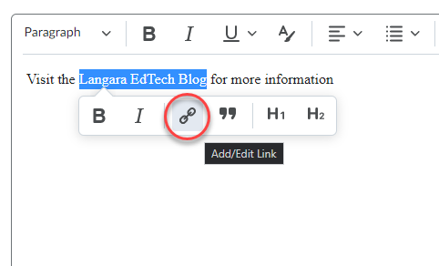
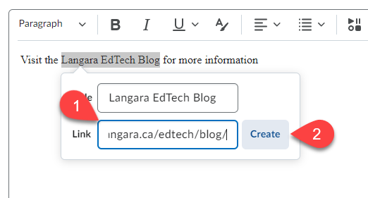
How to create a hyperlink

Select Insert Quicklink icon, then select URL in the popup window, enter the URL and a title that describes the link’s destination.

Suggestions for creating meaningful and accessible hyperlinks

  • Link text should be unique within a page, should be meaningful when read out of context, and should help users to know something about their destination if they click on it. Link text such as “Click here” and “More” fail to meet these criteria.
  • Avoid providing two links right next to each other that point to the same location (it can be confusing for screen reader users).

To request help with improving the accessibility of your course content, email edtech@langara.ca