
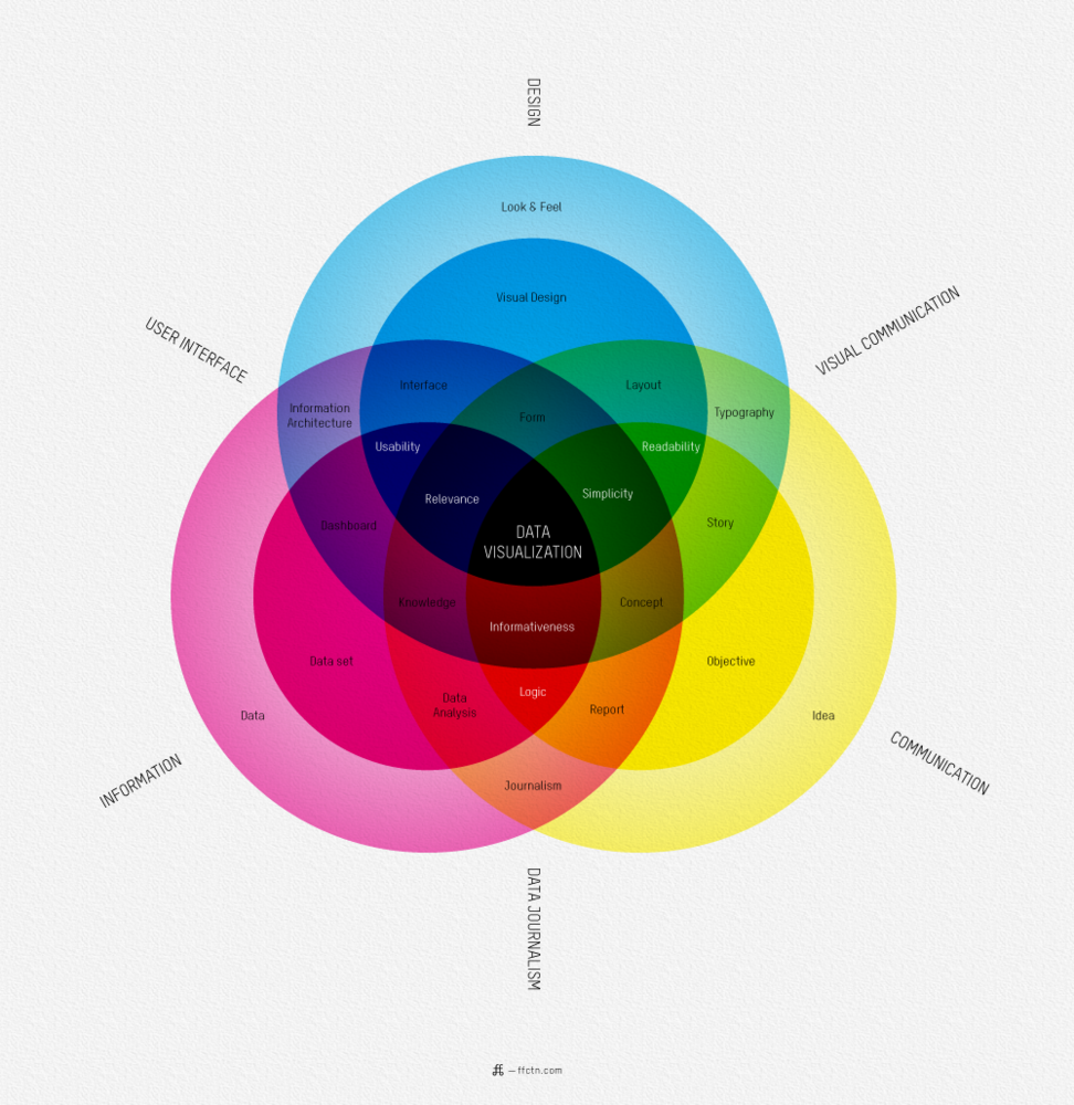
Infographics (sometimes known as Data Visualizations) can be powerful tools for presenting statistics, data, and other information in sophisticated and visually engaging ways. Whether you use them to examine the Cost of Tuition Across Canada, to map out the Evolution of Typography, or simply to navigate the amazing World of Beer (okay, this one might not be best suited to the classroom), the infographic has big potential in higher education.
Two great sites for finding infographics that you can use in your classes:
1. Visual.ly
2. Visualizing.org (many interactive visualizations here!)
You can also create your own infographics using free online tools. These two sites look promising:
1. Infogr.am
2. Easel.ly
Students could also try their hand at making simple infographics for a class assignment–a great way to exercise their creativity while learning a new online tool!
I’m interested in hearing about your experiences using infographics or visualizations in your classes. Have you tried incorporating them into your lessons? Think it’s a passing fad? Want some library help getting started with your own visualizations? I’d love to hear your thoughts in the comments!
–Annie, Communications Librarian